I’ve been brushing up on my Excel skills because it’s a must for a lot of analyst jobs that I’m applying to, and since I generally prefer to work in R, I went through the sample problem in both R and Excel. I may revisit this at some point and format it like an exercise, but for now it’s just the code to produce the solutions. I posted the Excel workbook in a GitHub repo, but if you’re smart and don’t want to download it from an unverified source, you can get the original from the UF Department of Statistics.
I won’t go through all of the solutions here, but here’s a side-by-side comparison of how to solve exercise 5 in R and Excel.
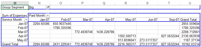
Make a pivot table of Expenses by Service Month and Paid Month for just the “Big” group segment.
Here’s what the top of the table looks like:
    Subdivision Group.Segment   Revenue Expenses Service.Month Paid.Month
1  Not Real Big           Big  9504.782 827.5632         04-07      09-07
2  Not Real Big           Big  6772.133 436.8800         01-07      01-07
3 More than 500           Big  8303.943 680.7504         03-07      04-07
4  Not Real Big           Big 10331.578 440.4744         02-07      02-07
5 More than 500           Big  7157.628 915.9245         01-07      01-07
6  Not Real Big           Big  4723.996 463.2899         05-07      05-07
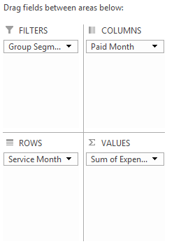
Use these options after you’ve created the pivot table and selected the range:
That gives you a table that looks like this:
I came up with two ways to summarize the information in the same way. Initially, I used aggregate in the stats package (plus a bit of fiddling to get the dates to display correctly). This is fine, but it presents the data in a long format:
> ex5 <- filter(ex5, Group.Segment=="Big")
> ex5.a <- aggregate(Expenses ~ Service.Month + Paid.Month, ex5, sum)
>
> my.Date <- function(x){
+ format(as.Date(x, origin="1899-12-30"), "%m-%y") ## Origin from Excel format
+ }
>
> ex5.a$Service.Month <- my.Date(ex5.a$Service.Month)
> ex5.a$Paid.Month <- my.Date(ex5.a$Paid.Month)
> ex5.a
  Service.Month Paid.Month  Expenses
1         01-07      01-07 2204.6559
2         01-07      02-07  650.9037
3         02-07      02-07 1780.3256
4         03-07      03-07  772.4839
5         03-07      04-07 1436.2288
6         04-07      05-07 1302.5007
7         05-07      05-07  913.8596
8         05-07      06-07  273.5117
9         04-07      09-07  827.5632
If we want to present it in the table format like we did in Excel, we can use dcast from Hadley’s reshape2 package:
> require(reshape2)
> ex5$Service.Month <- my.Date(ex5$Service.Month)
> ex5$Paid.Month <- my.Date(ex5$Paid.Month)
> dcast(ex5, Service.Month ~ Paid.Month, sum, value.var = "Expenses", margins = T)
  Service.Month    01-07     02-07    03-07    04-07     05-07    06-07    09-07     (all)
1         01-07 2204.656  650.9037   0.0000    0.000    0.0000   0.0000   0.0000  2855.560
2         02-07    0.000 1780.3256   0.0000    0.000    0.0000   0.0000   0.0000  1780.326
3         03-07    0.000    0.0000 772.4839 1436.229    0.0000   0.0000   0.0000  2208.713
4         04-07    0.000    0.0000   0.0000    0.000 1302.5007   0.0000 827.5632  2130.064
5         05-07    0.000    0.0000   0.0000    0.000  913.8596 273.5117   0.0000  1187.371
6         (all) 2204.656 2431.2293 772.4839 1436.229 2216.3603 273.5117 827.5632 10162.033
I tend to prefer this format since you get a visual indicator of the time lag.
Check out the other questions and answers in the GitHub repo. I’ve already extracted each sheet from the original workbook and saved them as seven separate CSVs for convenience.
